Preview
Our Solution
LinkedIn's Solution

The issue we were trying to solve with this project was the disorganization of LinkedIn's chat system. On the left is a video breakdown of what this 2 week long project accumulated to.
Interestingly, LinkedIn seems to have developed a similar feature after I had done this project (shown on the right). Not to say someone at LinkedIn came across this case study and decided to make the project, but I think it further validates the feature idea as well as our final outcome
Introduction
LinkedIn Chat Folders
If you’re like me, you LOVE music (maybe a little too much). It’s more than listening to something, it’s about crafting experiences and moods. Currently music lovers have tools like albums and playlists, even new AI implementations, to find and create them.
However, what actually contributes to these moods and how can we give more of that to the listener?
Team
Me (Designer, Project Lead)
Sandy Dreng (Designer)
Tools
Figma, Figjam, Google Forms
Timeline
2 weeks
Research

Our research participants (11 total) included
Students
Recruiters
Junior-mid level employees
Job seekers
General LinkedIn usage was recorded as shown on the left
Note: Terms like "Often" and "Occasionally" were not clearly defined, so results may be skewed due to inconsistent interpretations

We also saw that 80% of these users used the platform for networking. This ranked 2nd among other potential uses.
Findings
I gained insight to our 2 main pain points: Cluttered chats and inability to filter unwanted messages. 3 responses of 11 which capture this are shown below


Market Analysis
Another factor in our research was market analysis. We looked at 3 other commonly used messaging apps (Discord, Slack, and Instagram) and our findings are as follows:
Method of organization should be


Problem
LinkedIn's messaging system isn't organized enough.
With 875 million+ users in ~200 countries, LinkedIn is known as the staple professional platform.
However, connecting those millions of users can end up a cluttered mess which is exactly what users run into when using the messaging feature. To combat this, I thought of Chat Folders, an organizational feature for LinkedIn's messaging system that would address common, organization related user pain points.
Solution
Chat Folders
I thought of chat folders, a feature that allows users to create categories and sort their chats/messages. In order to keep the folders from getting confused with individual messages, the folders would also be displayed separately from the messages.
When asked, research participants agreed that at least the idea of this feature aligned with their goals when using the app.
Lofi
User Flow
We started with this flowchart which described how folders would fit into LinkedIn

Wireframes
These pages show my 3 initial sketches based on the flowchart: List, Button, and Horizontal Menu.
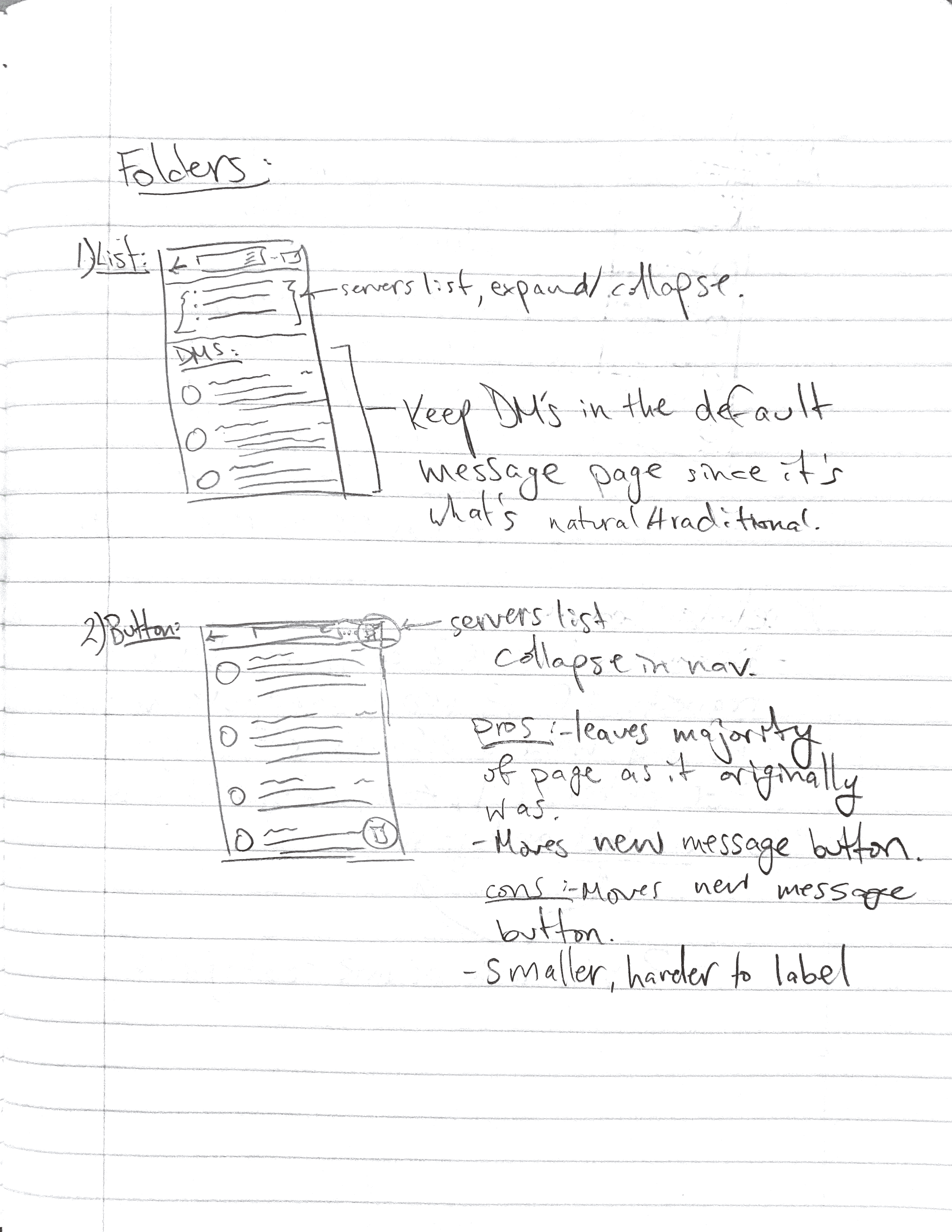

List: Inspired by Discord and Slack which vertically display all the folders (aka servers) at the top level.
Button: Developed off of List to mitigate the visual impact on LinkedIn's current messaging page. This button would replace the new message button in the top right and move it to a fixed position.
Horizontal Menu: Based on Instagram DM's which horizontally display a higher level category of folder (Primary, General, Requests).
We decided against List since it cost too much screen space and was too disrupting to what LinkedIn currently has. We then further explored Button and Horizontal Menu.
More Exploration
I explored 2 more lofi avenues, this time with additional frames of how to add a folder, Top tier, horizontal and Top tier, set amount menu


Midfi
Mockups


This first set of mockups shows 2 variations I did not end up pursuing. These versions were very similar, the only difference being the menu's position on the page.
I decided on solely using the set number of high level folders (Direct Messages, Groups, Folders, Requests).
Pros:
Does not disrupt original flow of LinkedIn messages system
Compact, especially with the 4 high level folder layout
Easy to customize
Cons:
Low discoverability
Folders page is very bare
Unnecessary extra frames

This final set of midfi mockups were created to explore Top tier, horizontal. This would end up being the design I ran with, though more research would be conducted to determine that.
Pros:
Very fluid and natural
Utilized 4 top tier folders layout most effectively
Less frames needed
Not too disrupting to LinkedIn's current messaging system
Cons:
Potentially misleading intractability, especially with swiping
Create folder function position is not ideal

The set of frames above is the flow in creating a new folder. This would be the basis of the flow I ended up using for the final designs.
More Research
More research was conducted where these 3 designs were pitted against each other in the image below to determine user preference among the 11 participants we had

Responses

Option 3, Top tier, horizontal, was preferred by 63.6% of participants against option 2’s 36.4% and option 1’s 0%. So I fleshed out option 3 to transition to hifi.

Prototype
Finally, I finished a hifi design of the feature based on the option 3 midfi. A few changes were made like having a search bar instead of just a folder title and adding a frame for the kebab menu, but overall the midfi stayed relatively intact.
Feel free to interact with the live prototype on the left.
(Note: the member selection frame can only be continued after selecting "Mikayla Poon")
Metrics
Our main 2 metrics for this feature were

4 people were interviewed to complete 3 tasks with our hifi prototype:
Create a new folder
Add “Mikayla Poon” to the folder, then add the 2 other connections that would fit a “LinkedIn connections” folder (Diego Ttito and Gary Wu)
Delete the folder you just created
Interview results:
Positives:
High task completion rate
Users were satisfied
Users would use the feature if it were implemented
Negatives:
Participants ran into some falsely perceived functions like swiping
Reflection
This was my first feature design and it was definitely different than building something from scratch. Though that presented its own challenges, it was also an advantage. I was familiar with the product, users were easy to find, and the base UI was available.
The biggest lesson for me was in the research. I now have an undoubtedly deeper understanding of how to weave users into the design process and how important it is to do so. Our research participants gave us our primary focus, our metrics, and valuable feedback for our designs.
Next Steps:
As I mentioned a few times in my case study, should this project be expanded I already have ideas on how to do so. Added metrics as well as accommodating for functions users perceived to be available but actually weren’t (such as swiping) are the 2 main things I would like to work on.